Apologies to anyone who thinks this is navel gazing of the highest order, but this is my blog, so Frick off!
Everything below relates to the second page of the strip, which doesn’t give away too much.
The finished strip ‘should’ be appearing in issue 5 of Zarjaz, which is due to be available in August.
1. Script.
Rich has a writing style that I like. He is terse and to the point. His scripts tell me who is where and then lets me get on with making sure that it works in the panel. For example:
Page 2
6 Frames
Frame 1: Smith’s pep talk seems to have worked, as they have all climbed from their cover and are on the battlefield. They are running in a group in front of Smith.
SMITH: SPREAD OUT DAMMIT! YOU’RE ALL TOO-
Frame 2: A shell impacts in the group, sending the four soldiers skywards, while Smith is diving to the ground.
SFX: WOOOMPH!
CAPTION: FRICKIN’ IDIOT GREENHORNS! I TOLD ‘EM DAMMIT!
Frame 3: Smith is on his feet. He’s with what’s left of the team. Two are still alive, their armour battered and cracked in places as they help each other up.
CAPTION: TWO LEFT. DUNNO THEIR NAMES. IT’S NEVER WORTH FINDING OUT.
Frame 4: Smith is pointing over his shoulder with his thumb towards the Geek lines. One of the recruits is beside him, while he other is crouching beside one of their fallen comrades.
SMITH: THE JOB’S THIS WAY, KIDDIES.
CROUCHING RECRUIT: SIR! HOLLIS IS STILL ALIVE!
Frame 5: Smith is standing over the injured Hollis, who’s being cradled by the other recruit. Hollis has a sizable lump of shrapnel sticking out of his chest.
SMITH: HIS NAME WAS HOLLIS, HUH?
Frame 6: The recruit is looking up at Smith.
RECRUIT: IS, SIR. HE’S WEAK BUT BREATHING, WE NEED TO GET-
…and there we leave it. Rich has moved the plot forward, given me a nice action shot to draw and set up a ‘turn-over’ to encourage the reader to turn the page over. All good. Next I’ve got to turn this into…
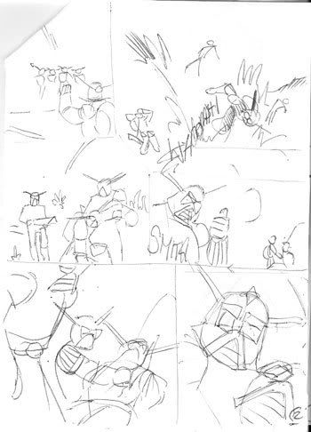
2. Thumbnails.
These are done in biro, on scraps of paper approx 15x10cm (A6) size. They are always rough and are there to show me how the various layouts of the panels will work. Unfortunately I only keep the version of these that I am using for the final, as it would have been nice to show the other versions I did and explain why that version of the page was scrapped. Another thing with this is that I can begin to look at the amount of text required and make sure I leave enough space in the panel.
3. Pencils.
As this is for Zarjaz, and given that Zarjaz prints at A5, I decided to produce the original art for this strip at A4. So… with my thumbnail by my side and my trusty automatic pencil in hand I produced this…
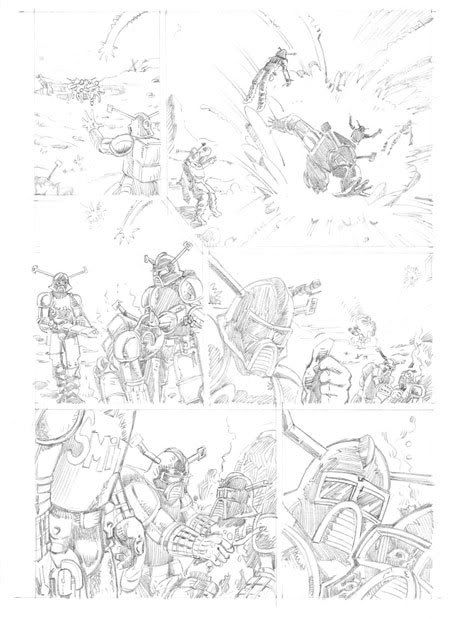
The pencils vary only slightly from the thumbnails, and I decided to make as much of the pencils ‘full’ as I could. In the past I have pencilled the bare minimum needed to convey the story and then gone into inks to add all the detail. Full pencils take more time but deliver a much richer feel to the finished page. This strip, and indeed all strips I’m working on at the moment, are pencilled completely before the inks are added. As this is a 6 page strip this means that I pencilled another 4 pages before the pens come out.
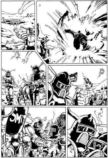
4. Inks
Not really much to say about these, as they are mostly refinements of the pencils. I did discover that I wasn’t drawing the helmet consistently in this strip, so I tried to alter the last panel to fit more in with how the helmet looks in later pages. Altering art in the inking is something I try to do less of these days, in an effort to raise my standard of finished art. Material wise I am a penman. I have a really nice Edding 0.1 nib pen that I have use for the last three months, and I’m lucky enough to have a box of cheap nylon tips that have a really fine point. They only last about 5-6 pages before the nib begins to blunt. After that they are good for outlines and filling in.
5. Tones.
Before I add the tones I transfer the image from the hand drawn to the digital. I scan at 300dpi in bitmap, which I then transform over to greyscale. The actual scan image is larger than the printed, so I adjust the size to make sure the page will fit into the available printing area for Zarjaz. Once I’ve got that sorted I save the document as a TIFF with LZW formatting. Then I have a page that I can play with to my hearts content from now on without destroying the work I’ve put in so far.
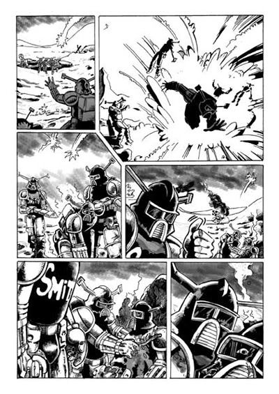
I’m colour blind (which is a massive pain in the arse as you would imagine) to the degree that I do not trust myself to colour anything. So this strip being in B&W was a nice opportunity to have a play with grey-tones. In the past I’ve toned my strips either with a pencil onto prints of inked pages or by selecting a level of grey in photoshop and plonking it on with a brush tool. Dan (who will be 16 in just a few months, where do the years go?) is something of a phototshop wizard in my eyes and he has created me a custom brush, which had a feel to it that I was happy to use. By sorting a couple of extra layers in the image I was able to apply backgrounds and details to the art that, in my opinion, really add to my image and lift it quality wise.
I am still learning to use this technique and plan on developing a ‘look’ for my pages that is both pleasing to work on and look at. Time will tell though.
6. Lettering.
Something I have really embraced over the last few years is computer lettering. I remember hand-lettering strips back in the ‘80’s and the results were always poor. I could not understand how the letterers of the time got such great results with the tools available. Of course I was just being crap and eventually I got better. The biggest aid to my lettering was getting access to a PC, as the simple matter of being able to produce the text in a uniform font across the whole strip really helped. I was also getting to be quite reasonable at crafting my balloons then as well, so my lettering was actually readable at last.
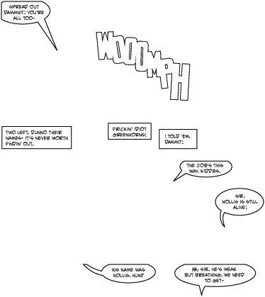
However it is Adobe Illustrator that has enabled me to finally produce lettering for comics that I am proud of. I’m still learning, but aren’t we all?
This page contains a set of standard balloons and captions as well as a cracking opportunity for SFX. Illustrator is great for this sort of thing as you can play with letter placement to your hearts content and then, when happy, you can finish the image in almost any style you can think of.
I’m becoming a bit of a font hoarder, and sites like Blambot are brilliant for getting started with lettering digitally. The font I’m using for this is ‘Evil Genius’ which has a nice legible style while still looking interesting. I’m sure I’ll change again soon though.
7. Final page
Here is the final page, all assembled in photoshop and ready for printing.
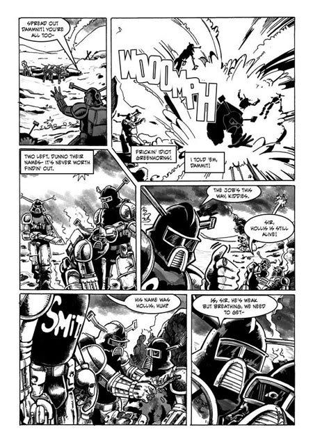
Hopefully this will be in the August edition of Zarjaz, where you’ll be able to see the rest of the strip proper.

3 comments:
Brilliant!
thats great, might pick up zarjaz when i'm next in fpi.
KYUSS
Nice one Dave...excellent that!
Hi thanks foor sharing this
Post a Comment